
Introduction: The Impact of User Interface & User Experience
When a user visits your website or opens your mobile app, the first thing they notice is the design — and how it feels to use, which is the essence of good UI/UX.
In fact, 94% of first impressions of websites are based on design.
(Source: loopexdigital.com)
Let’s quickly define the two core terms:
- UI (User Interface): The visual and interactive elements — layout, colors, buttons, icons, typography.
- UX (User Experience): The whole journey a user has — clarity, ease of use, responsiveness, and satisfaction.
In today’s digital-first world, with hundreds of online alternatives just a click away, your site’s UI/UX is no longer a “nice to have” — it’s often the deciding factor in:
- Whether a user stays on your site
- Whether they engage with your content
- Whether they become a paying customer
Great UI/UX = Business Growth
A well-designed site or app isn’t just about aesthetics — it directly impacts your bottom line.
Think about your behavior:
- You trust a website that is clean, professional, and easy to navigate
- You leave or second-guess a site that is cluttered, slow, or hard to use
Now, multiply that decision-making behavior across your entire customer base .
Tangible Benefits:
- Improved conversion rates
- Higher customer satisfaction
- Increased brand credibility & trust
- Lower bounce rates
- Greater repeat business
UI/UX in the Bangladeshi Context
As businesses in Bangladesh rapidly transition to digital platforms, consumer expectations are rising.
More customers are now:
- Shopping online
- Using mobile banking
- Booking services from their phones
Their expectations are shaped by global platforms — which means your design must meet international standards to compete locally.
That makes UI/UX a crucial investment for Bangladeshi companies, particularly those seeking to succeed in the digital landscape.
Designing a website with great UI/UX means more than just making it “look good.”
It requires following established design principles that improve user satisfaction and drive conversions.
Let’s dive into the most important ones:
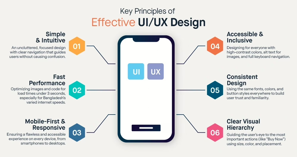
1️⃣ Simplicity & Clarity
“Simple” doesn’t mean boring — it means uncluttered, focused, and purposeful.
- Use clean layouts with white space
- Avoid unnecessary animations, pop-ups, or overly complex visuals
- Make it easy to understand what buttons do and where content belongs
Goal: Keep the user focused on key actions and content — without confusion or distraction.
2️⃣ Consistency
Design consistency creates familiarity and trust:
- Use a standardized style guide: same colors, fonts, and button styles across every page
- Navigation menus should appear in the exact location, site-wide
- Once users learn how one page works, the rest should feel intuitive
Example: If your “Sign Up” button is green and round on the home page—make sure it looks the same everywhere else.
3️⃣ Mobile Responsiveness
With a majority of Bangladesh’s internet traffic coming from smartphones, responsive design is mandatory.
- Your design must adapt across mobile, tablet, and desktop
- Menus should be tap-friendly, and content shouldn’t be cut off
- Typography should remain readable on small screens
And don’t forget: Google ranks mobile-optimised sites higher in mobile search results.
4️⃣ Fast Load Time
Speed is one of the most overlooked yet crucial UX factors.
- Compress & optimize images
- Use efficient code
- Host your site with performance in mind
⏱️ Target Load Time: Ideally under 3 seconds
Especially in areas of Bangladesh with slower internet, a lightweight design dramatically improves the experience and reduces bounce rates.
5️⃣ Intuitive Navigation
Users shouldn’t have to guess how to use your site.
- Organize pages in a logical hierarchy
- Use clear labels like:
-
- 🛒 “Products”
-
- 💼 “Services”
-
- 🙋 “About Us”
-
- 📞 “Contact”
- Add a search bar for content-heavy sites
- Keep navigation visible and consistent
🗺️ Intuitive navigation = longer sessions + more conversions.
6️⃣ Visual Hierarchy
Guide people’s eyes to the most important elements first.
Use:
- Font size
- Contrast & color
- Whitespace
- Placement on the page
Example:
On a product page, the “Buy Now” button should be large and bold.
Specs? Smaller text below.
Without visual hierarchy, users feel lost and miss your most valuable CTAs.
7️⃣ Accessibility
Accessible design = inclusive design.
Don’t just design for one type of user — make sure everyone can use your site effectively.
Important accessibility practices:
- High color contrast between text & backgrounds
- Alt text for all images
- Keyboard navigation for all interactive elements
- Clear focus indicators and form labeling
Accessibility improves the experience for all users, not just those with disabilities — and it boosts your reputation and reach.
Ultimately, excellent UI/UX is about empathy:
Putting yourself in the user’s shoes and designing a site that’s natural, helpful, and human-centered.
Common Web Design Mistakes to Avoid
Even with the best intentions and design principles in mind, businesses often make critical mistakes that harm the user experience (UX) and hurt conversions.
Here are the most common web design pitfalls — and how to avoid them:
Common Web Design Mistakes & How to Fix Them
| Mistake | Why it Hurts UX | Solution |
|---|---|---|
Cluttered Pages |
Overloaded visuals, too many elements, and a lack of visual hierarchy make it hard for users to focus or take action. Leads to confusion and high bounce rates. | Use clean layouts, limit distractions, and design each page around one clear objective. Simplify — when in doubt, remove unnecessary elements. |
Not Mobile-Friendly |
Non-responsive designs lead to poor usability on mobile — pinch-zooming, broken layouts, and small buttons. In Bangladesh, where mobile phones dominate internet access, this is a significant barrier to conversion. | Always use responsive design frameworks like Bootstrap or CSS media queries. Test your site across devices to ensure a seamless mobile experience. |
Slow Loading Speeds |
Users expect fast performance. Even a 1-second delay can cause drop-offs — especially on slower internet connections, which are standard in Bangladesh. |
Optimize performance with: • Image compression (WebP, TinyPNG) • Code minification • Browser caching • Reliable, performance-focused hosting ⏱️ Aim for under 3 seconds load time. |
Confusing Navigation |
Hidden menus, too many items, or unclear hierarchy make it hard for users to find what they need. Frustration leads to early exits. |
Keep navigationsimple, intuitive, and consistent: • Use recognizable labels • Limit menu items • Add breadcrumbs where needed • Ensure key pages are within 2 clicks. |
Lack of Clear Call-to-Action |
If users don’t know what to do next, they leave. Vague or buried CTAs result in lost leads, sales, or engagement opportunities. |
Make CTAsvisible, action-oriented, and branded: • Use buttons with clear text: “Get a Quote”, “Start Free Trial” • Place CTAs above the fold • Treat your CTA as your digital sales rep. |
Inconsistent Design & Branding |
Inconsistent fonts, colors, layouts, or missing branding elements confuse users and reduce trust. Visitors may doubt if they’re still on your site. | Apply a consistent brand style guide across all pages. Maintain uniformity in typography, color schemes, logo placement, and UI elements to reinforce brand identity and build trust. |
Ignoring User Needs |
Designing for aesthetics over usability frustrates users. Prioritizing company-centric content (e.g., history) over what users want (e.g., pricing, product info) leads to poor engagement. | Design for user intent. Use user personas, honest feedback, and A/B testing to align your site with what your audience wants to know or do. Put the user at the center of every design decision. |
🔎 It’s not about what you want to show — it’s about what they need to see.
Final Tip: Test with Real Users
Before publishing — or even after launch — conduct usability testing:
- Ask 3–5 people (internal or real users) to navigate the site
- Give tasks like “Find the pricing page” or “Buy this product.”
- Observe where they get stuck, ask questions, or leave
This kind of testing reveals silent blockers before your customers experience them.
How Great Web Design Boosts Conversions and Customer Satisfaction

Investing in good UI/UX design isn’t just about aesthetics — it directly affects your bottom line.
From better first impressions to long-term loyalty, here’s how a well-designed website helps you convert visitors into customers and keep them coming back:
Better First Impressions = More Trust
Remember:
Users form an opinion about your website within milliseconds.
Whether they stay or leave depends on that first visual and emotional impression.
Professional design = instant credibility.
When your site looks current, clean, and well-organized:
- ✅ Visitors are more likely to trust your brand
- ✅ They feel confident sharing personal data or making purchases
- ✅ They explore more pages instead of bouncing immediately
In Bangladesh’s increasingly digital economy, a modern and well-structured website can set your business apart, especially in competitive markets like fintech, eCommerce, or education.
Higher Engagement & Lower Bounce Rates
Great UX = more interaction.
Visual clarity, intuitive navigation, and smart content layout result in users who:
- Stay longer
- Scroll deeper
- Click more often
- Visit more pages
This improves:
- 🤝 Conversion probability (e.g., newsletter signups, product views)
- 📉 Bounce rate (fewer users leaving after 1 page)
- 🔍 SEO (because Google sees engagement as a quality signal)
🎯 Examples of high-engagement UX:
- Product filter systems
- FAQ pages that answer real customer pain points
- Sticky navigation that helps users move around quickly
Clear Pathways to Conversion
Well-crafted UI/UX design leads users down a logical and persuasive journey.
Let’s say a user lands on your website. Does your design guide them naturally toward:
- 🛒 Buying a product?
- 📩 Signing up for a service?
- 📞 Contacting your sales team?
Examples that boost conversion:
- A visible CTA button at the top AND throughout the page
- A simple checkout form with progress indicators
- Minimized steps to complete an action
📈 According to loopexdigital.com, a well-designed UI could improve conversion rates by up to 200%.
Improved Customer Satisfaction & Loyalty
Conversion is just step one. Great design also ensures that users leave happy.
When a customer experiences:
- Fast order tracking
- Easy access to support
- A smooth portal/dashboard
…they’re far more likely to:
- Become repeat buyers
- Leave positive reviews
- Choose your brand again over your competitors
Bonus: Features like a customer knowledge base or FAQ system reduce customer support strain while empowering users to self-serve.
🧠 When people enjoy the experience, that becomes a reason to stay loyal, not just the product or price.
Positive Word-of-Mouth & Referrals
🙋♂️ “It was so easy to order from their site!” 🙅♀️ “I gave up halfway because their website was a mess.”
Users’ notice experience — and they talk about it.
- ✅ Positive UX = more referrals
- ✅ Frictionless design = more sharing
- ✅ Great CX = more positive online reviews
A seamless user experience can turn a casual visitor into a brand promoter — and we all know that trust in peer recommendations is immense in both local and global markets.
The ROI of UI/UX: Real Results
The stats speak for themselves:
- Customers with the best experiences spend more
- A single friction point in your UX can cause users to abandon purchases
- UX-focused redesigns consistently result in:
- 🔼 Higher sales
- 🔁 Better retention
- 👏 Improved NPS (Net Promoter Score)
A happy user is more likely to convert, spend more, and return.
Great UI/UX isn’t a cost — it’s a growth strategy.
KuiperZ’s Approach to UI/UX and Web Design

At KuiperZ, we understand that your website is often your customer’s first experience with your brand.
That’s why our design process focuses on creating websites that not only look great — but work hard for your business.
Here’s how we approach UI/UX and web design to create platforms that convert, perform, and delight:
User-Centric Design
Every KuiperZ project starts with one fundamental question:
“What does your user want to accomplish, and how can we make that easier?”
Our process begins with research and discovery:
- Understanding the target audience (local Bangladeshi users or global markets)
- Mapping out user journeys and customer personas
- Identifying pain points and intuitive pathways
End Result: Visitors can find info, contact support, or complete a purchase without confusion or friction.
We don’t design for screens — we design for people.
Modern Aesthetics with Brand Identity
We blend contemporary design trends (clean UI, mobile-first structure, quality visuals) with your brand’s unique identity.
No cookie-cutter templates here. We ensure:
- Your site feels fresh and modern
- The colors, typography, and style reflect your brand’s voice
- It looks trustworthy and aligned with what you stand for
💡 Example:
- A fintech startup might get a sleek, minimalist layout
- An education provider might benefit from warmth and structure
- A corporate law firm project will prioritize professionalism and legibility
Regardless of industry, your brand will look professional, cohesive, and memorable.
Responsive & Performance-Optimized
We aren’t just designing for desktops — we build for phones, tablets, and all screen sizes.
Our team ensures:
- Fully responsive design across devices
- Optimized images and assets for blazing-fast loads
- Mobile networks in Bangladesh are factored in — we build sites that thrive even on slower connections
- Lightweight coding and SEO-aware architecture
Speed is UX. A page that loads fast reduces bounce and boosts engagement — and Google rewards it.
Iterative Design & User Testing
We don’t release websites without testing — and we don’t assume we’re always right.
KuiperZ follows an iterative design process:
- Start with wireframes and prototypes
- Run user testing and internal feedback rounds
- A/B test different versions of critical pages
- Improve based on behavior data and insights
This means potential issues are caught before they go live — and your final website is data-backed and user-approved.
Conversion-Focused Layouts
We design to impress visitors, but also to drive results.
We design:
- Strategic CTA placement
- Contact forms placed where traffic is hottest
- Smooth user flows that support shopping, booking, service inquiries, and content downloads
We also:
- Integrate analytics (Google Analytics, Hotjar, etc.)
- Optimize conversion pathways with real data.
- Support performance tuning post-launch
KuiperZ websites don’t just look good — they perform.
(And Yes, We Handle Content Too…)
From UI/UX copy to CTAs, we ensure:
- Clear, persuasive headlines
- Easy-to-scan content layouts
- SEO-friendly structure that ranks and reads well
📝 But that’s a topic for another blog. Just know:
✅ At KuiperZ, design and content work as a unit, not in silos.
A Powerful Web Presence Starts with KuiperZ
Our approach is holistic:
- ✅ Design that reflects your brand
- ✅ UX that anticipates your users’ needs
- ✅ Strategy that supports your goals
- ✅ Testing that ensures trustworthiness
- ✅ Optimization that evolves with your business
We’ve built custom websites for e-commerce startups, educational institutions, logistics platforms, fintech companies, and more — always tailored to real users and real business growth.
When you work with KuiperZ, you don’t just get a pretty interface — you get an intelligent system built to transform visitors into loyal customers.
Conclusion
In the digital world, your website or app is often the first impression potential customers have of your business.
And as we’ve seen throughout this blog:
🎯 UI/UX matters.
A great design can be the difference between a visitor bouncing away and becoming your next loyal customer.
By:
- ✔️ Following proven design principles
- 🚫 Avoiding the most common pitfalls
- 👥 Centering the user in every design decision
…your business can significantly boost engagement, conversions, and customer satisfaction.
📊 Whether you’re running a startup or an enterprise, “user-first design” is not just a trend — it’s a growth driver.
🧠 Remember:
Investing in user experience is investing in customer happiness — and ultimately, your success.
Is It Time to Rethink Your Website?
- Does your current site feel outdated or hard to navigate?
- Are your visitors not converting into leads, customers, or signups?
- Planning a new digital project and want to get the design right from day one?
KuiperZ Can Help
KuiperZ specializes in UI/UX and web design for businesses in Bangladesh and beyond.
We create websites that are:
- Visually compelling
- User-friendly across devices
- Optimized for conversions
- Built for performance and speed
- Aligned with your goals and brand
Let our experts design a platform that not only looks amazing but also performs, delivering measurable results.
Start Your Web Transformation Today
Contact KuiperZ now to schedule a free consultation.
Let’s discuss your business goals and explore how thoughtful design can help you achieve them.
Reach out to KuiperZ now: [email protected]
Or call us directly: (+880)1404 00 89 49
Or visit us: kuiperz.io/contact
Your business deserves a digital presence that stands out.
Let KuiperZ make it happen — with strategy, creativity, and world-class UI/UX.


